Branding and Identity, Audit Plus
Audit Plus is a newly founded auditing and finance consulting company in Prishtina. Yet, at Audit Plus, big plans lay ahead and some very modern and sleek solutions will be available soon for all who need internal auditing and financial services. We had a great time working for Audit Plus, and finally, we are presenting their new identity.
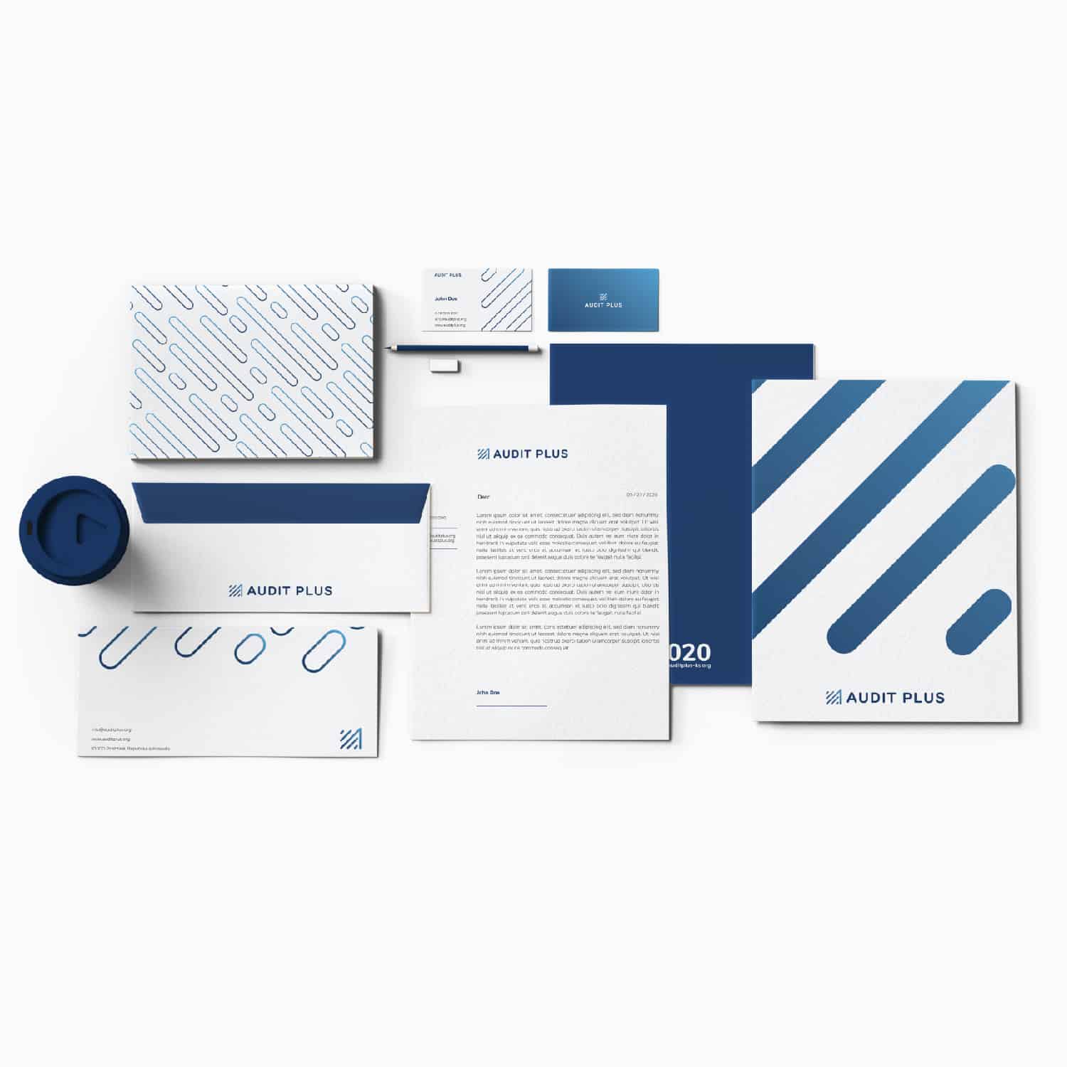
For a few weeks, we were tasked with providing a solution for Audit Plus’s identity. The client wanted to have an icon that would feel minimal, but modern; represent the “A” for Audit, the growth, and internal audit. Our team came up with a simple, yet beautiful solution. Hence, combining all the desired results with an icon that is not very easily forgotten.
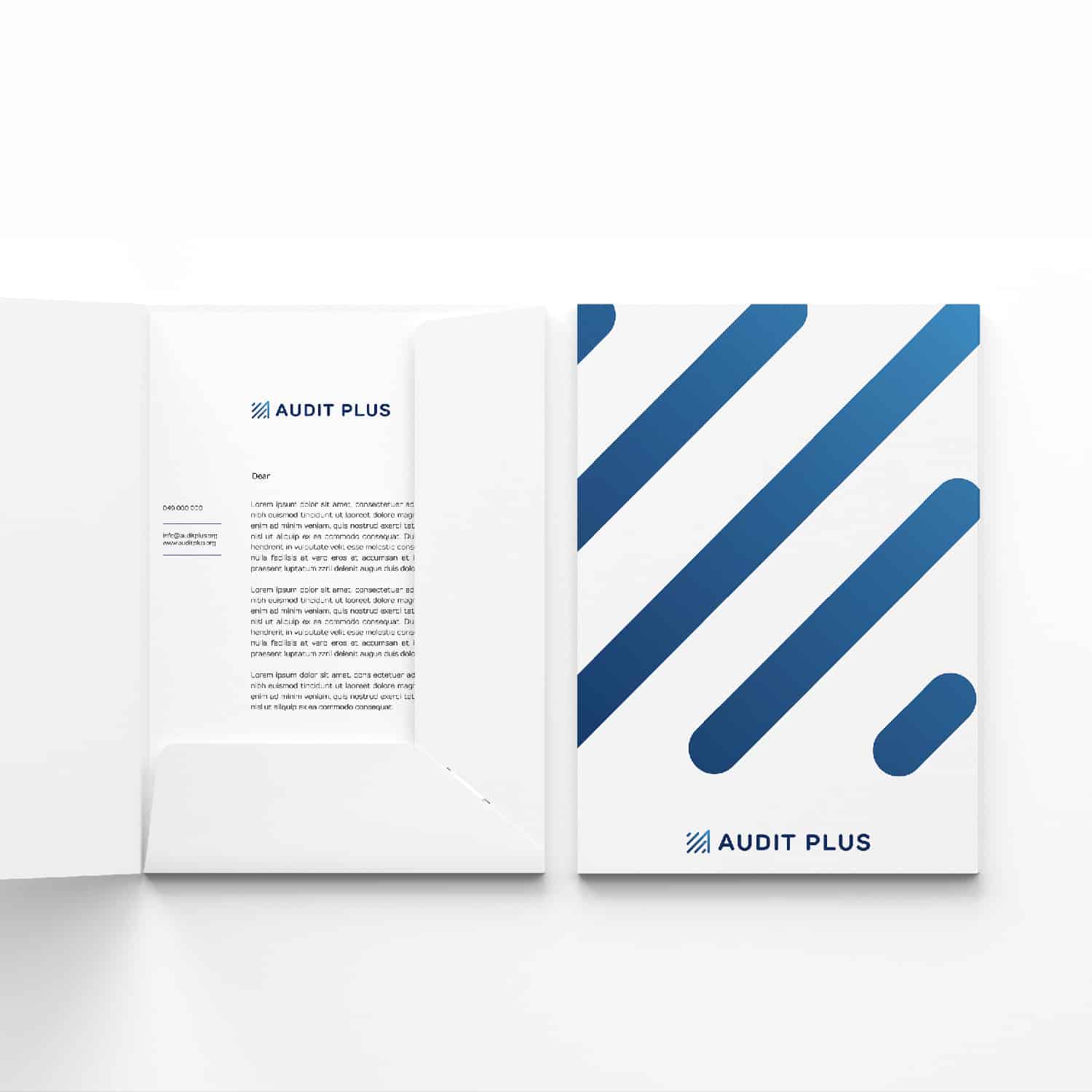
The logo is a compact combination of the letter “A” and the lines representing growth; while there is a hidden symbol for internal audit in between the growth lines. The rounded corners represent friendliness, welcoming, and trust, the overall icon sets a very strong, dominant emotional tone. This trademark helps audiences easily identify Audit Plus’s website, social media presence, ads, and other materials, enhancing the professionalism of the brand.
Thank you Audit Plus for your trust, it is a pleasure to keep working with you. Our team at Horizon is constantly growing professionally, we love challenging ourselves. We are happy to provide free consultations for all the services we provide. Please, check our portfolio, or drop us a message.
Check Audit Plus for more info:
Info


Related Projects